My team and I were asked from the client Loss Prevention Research Center to come up with a solution to prevent losses related to self-checkout, all while enhancing the user experience. Losses are either intentional or unintentional. Intentional losses occur when an individual intends to steal an item. Our approach to the solution was to create an interface that users with low technology literacy find intuitive.
Role: UX designer
Duration: 2 months
Tools: Figma, InVision
Team: 3 members
Many products are still being taken from self checkout systems, both intentional and unintentional.
In order to keep our interviews focused towards the focus statement, we
created a list of interview goals. These goals will guide us in our interviews to
ensure we gather the data we need.
• Learn when, how and why customers are creating unintentional losses.
• Gather any issues that customers have with the current functionalities of
self-checkout terminals, specifically with the scanning/entering of
merchandise.
• Understand how the environment around the self-checkout terminals affect
the user experience of the customers.
• Learn why customers may prefer a personal cashier and what attributes from
their experiences with cashiers can be transferred over to self-checkout
terminals.
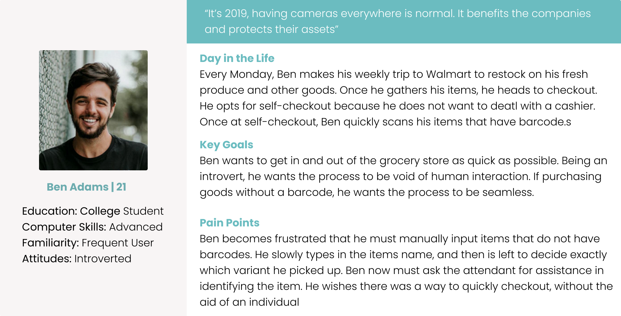
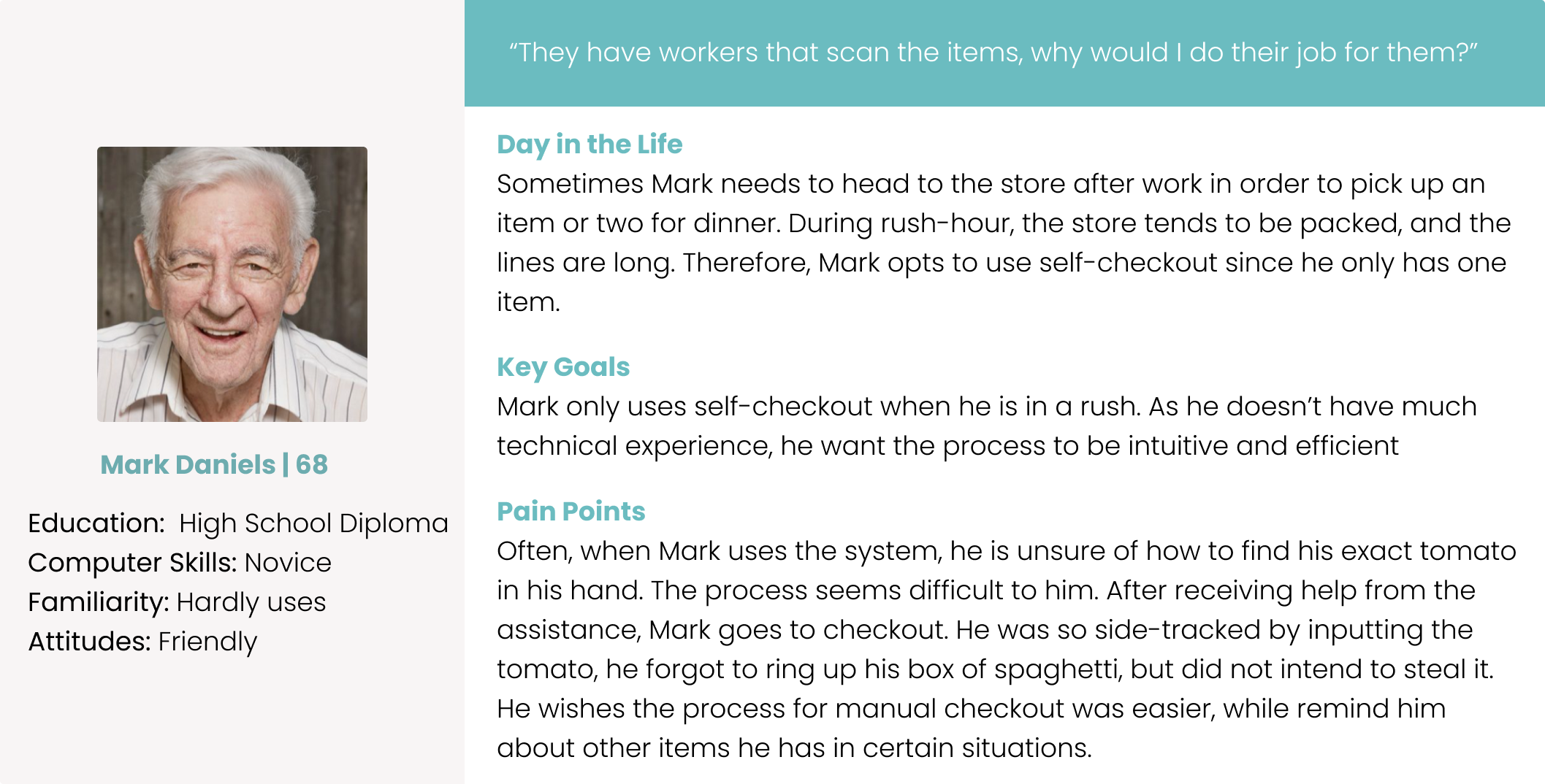
In regards to recruiting users to interview, we are targeting people that
shop at stores that provide self-checkout terminals. These include, Walmart
and Home Depot. Due to time and other limitations, we were not able to
physically go to the stores to conduct the interview. Therefore, we reached
out to students and other individuals, who do shop at those stores on a
normal basis. The client did indicate in the project brief that we could use UF
students as our user base.
• In addition to conducting our own interviews, the client has indicated that
they have pre-existing data from their own user research. This data should
cover aspects of user research related to intentional losses, as it has interviews
with convicted shoplifters. Further, it could help us broaden our audience
to be more inclusive of all types of shoppers.
After collecting interviewee data, we mapped out each answer onto sticky notes to easily categorize reoccuring thoughts.
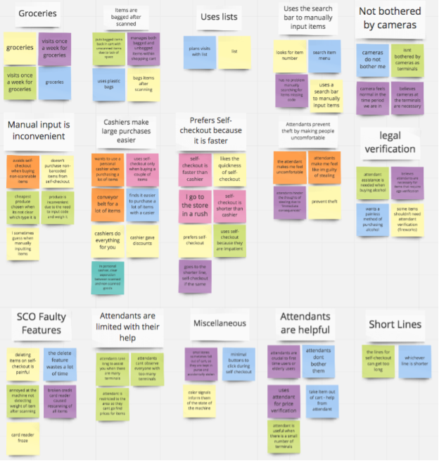
After looking at the collected data and grouped notes, the summary of the major themes were:
Overall, students prefer using self-checkout because the lines are a lot faster than cashier lines
Many felt that an addition of an attendant makes them feel uneasy about stealing, however the cameras do not bother them
Some mentions that it is inconvenient when they:
- buy unscannable items
- unclear which type of produce was bought
- needed weight and code for produce
- delete features wastes a lot of time
Based from affinity diagramming and findings, we discovered three key user
needs.
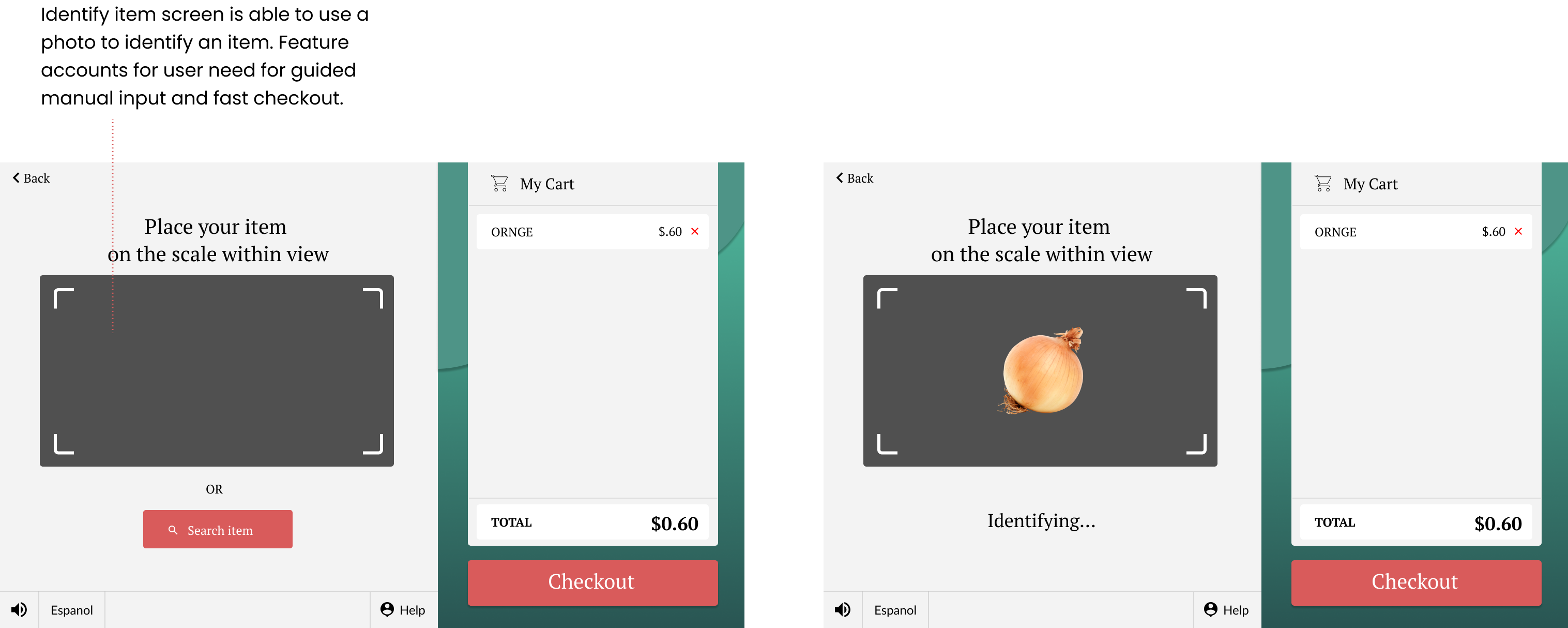
1) The user needs a faster way to use self-checkout, specifically when it
comes to non-barcoded goods.
2) The user needs to be guided throughout the process of manually inputting
items.
3) The user needs to be held accountable for items they have not rung up
yet.
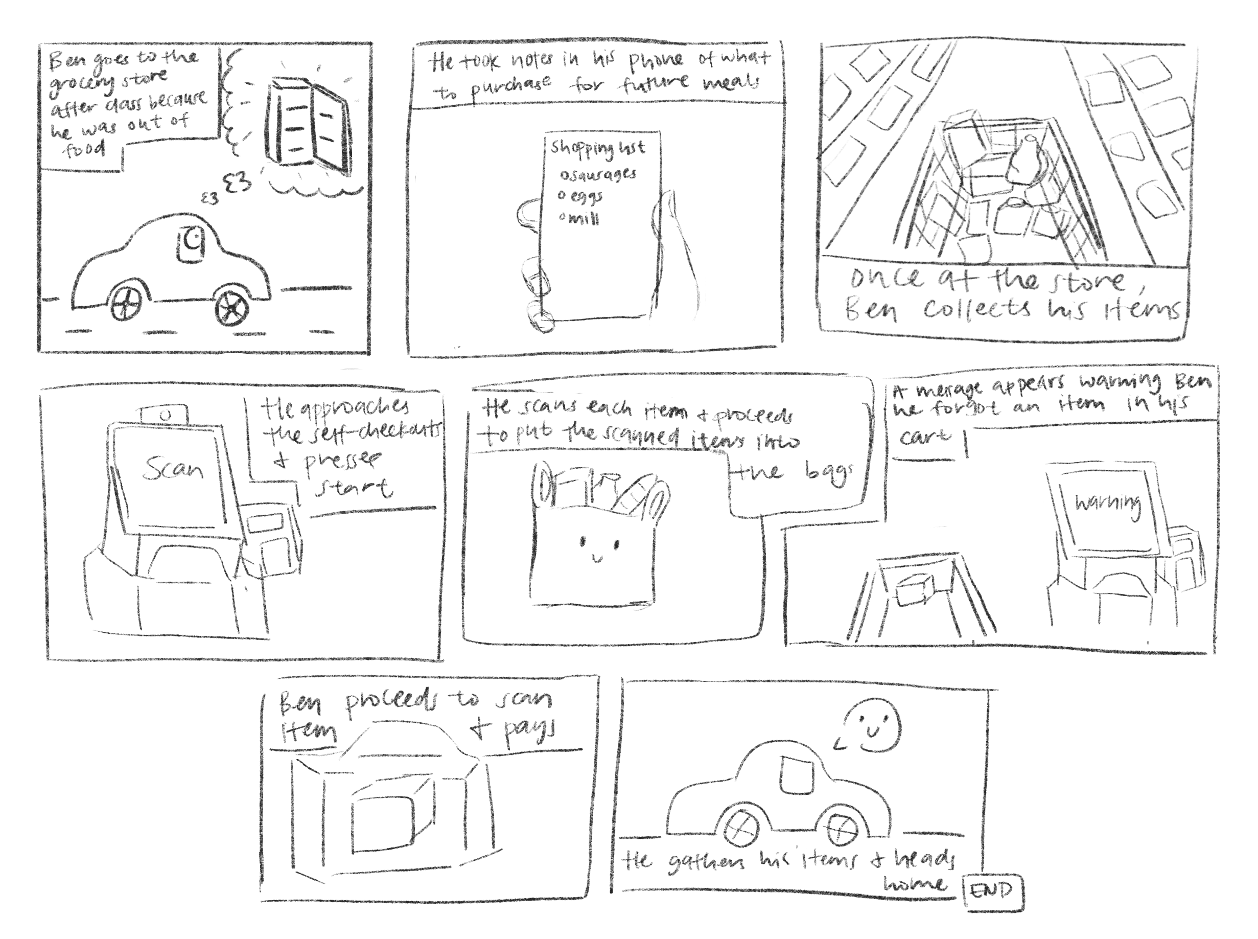
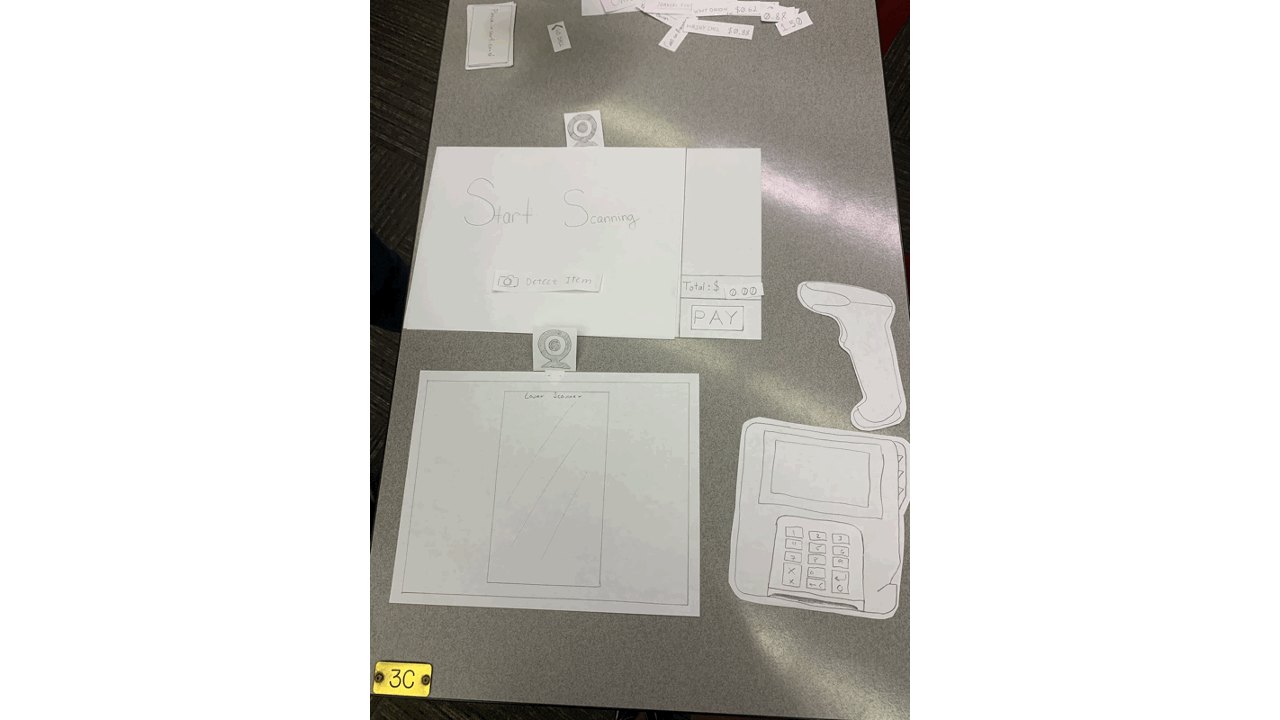
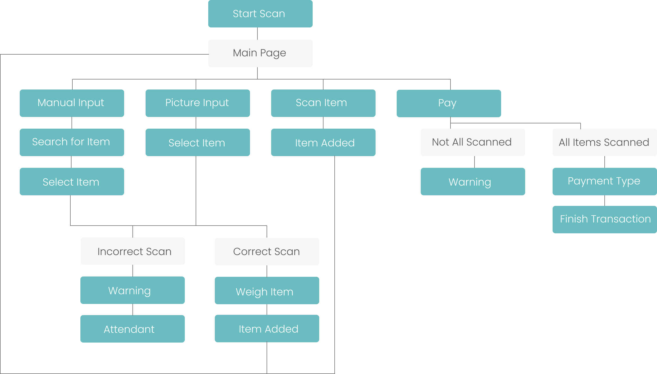
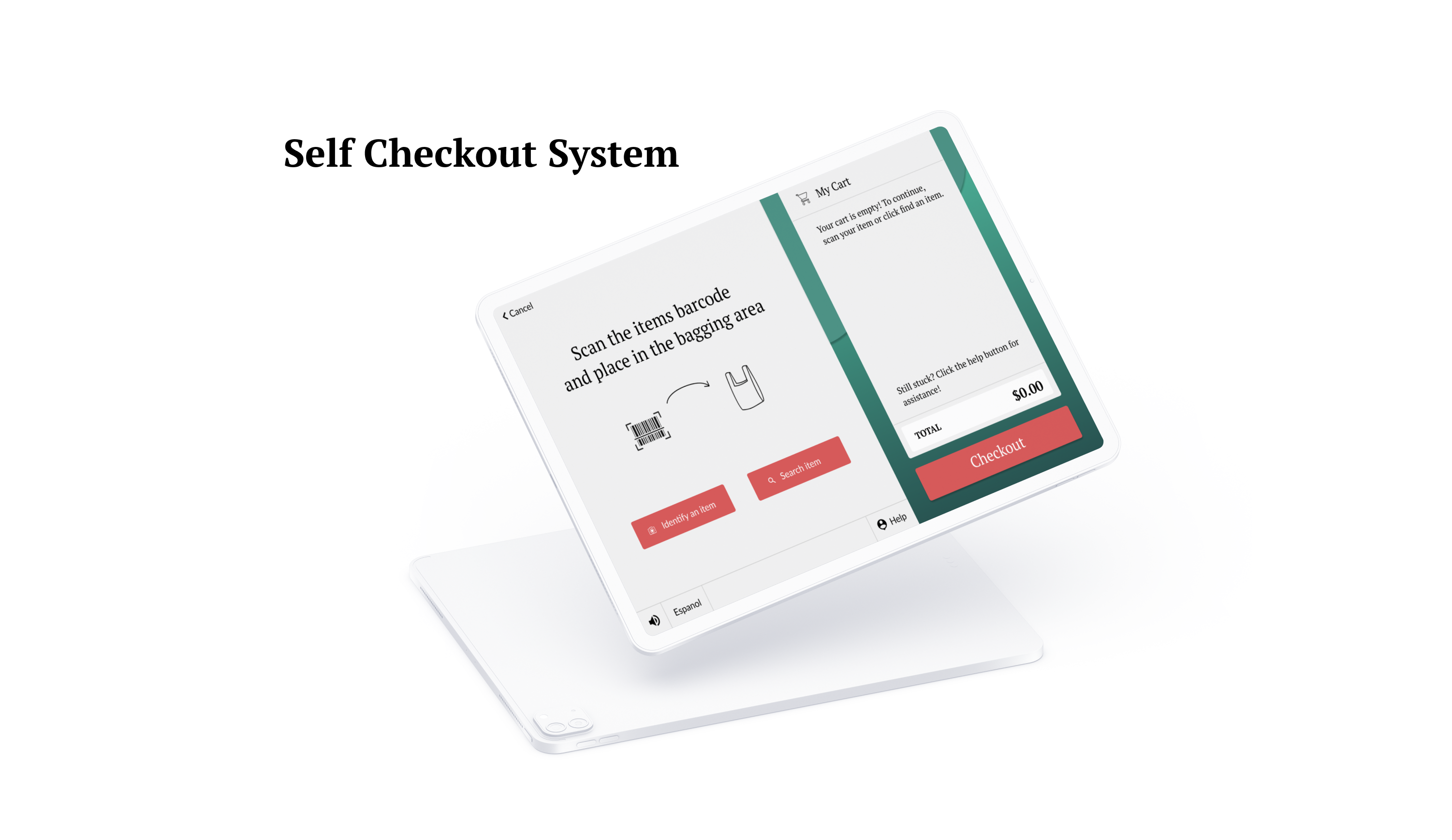
When designing the wireframes, I made sure user needs were being fulfilled, while maintaining the flow of the system.
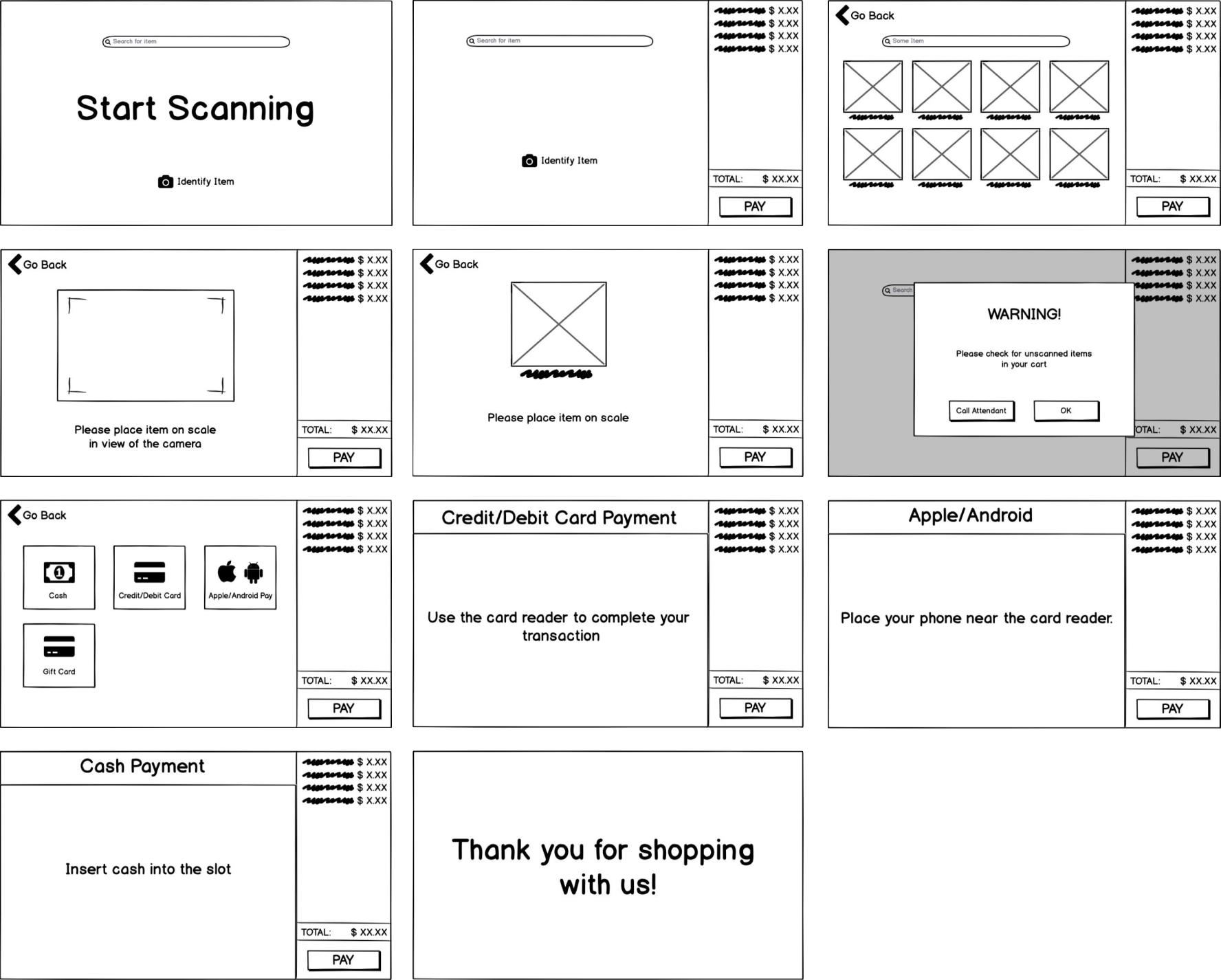
Link to public InVision: https://invis.io/MEUSA239HGC
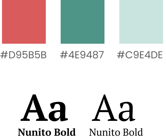
When looking for a color palette, I knew that I wanted to incorporate green. After using green as the primary color, I looked for a complementary color, red, that would make the buttons more visual.
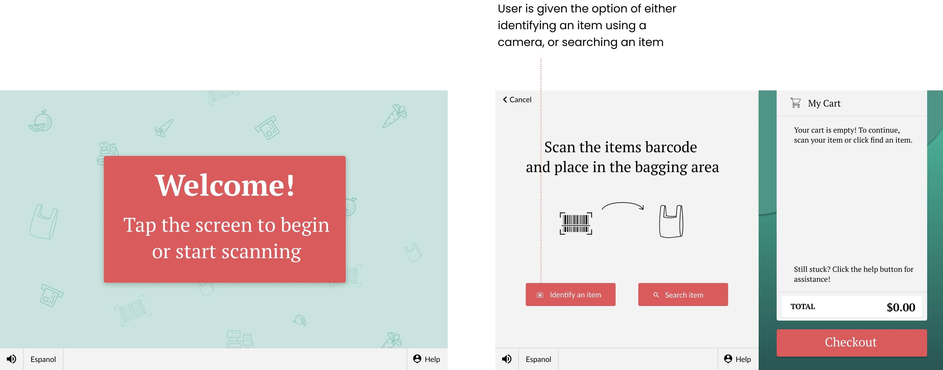
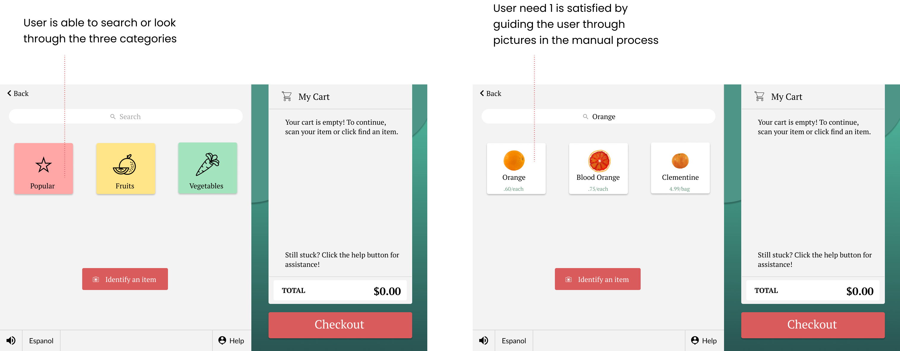
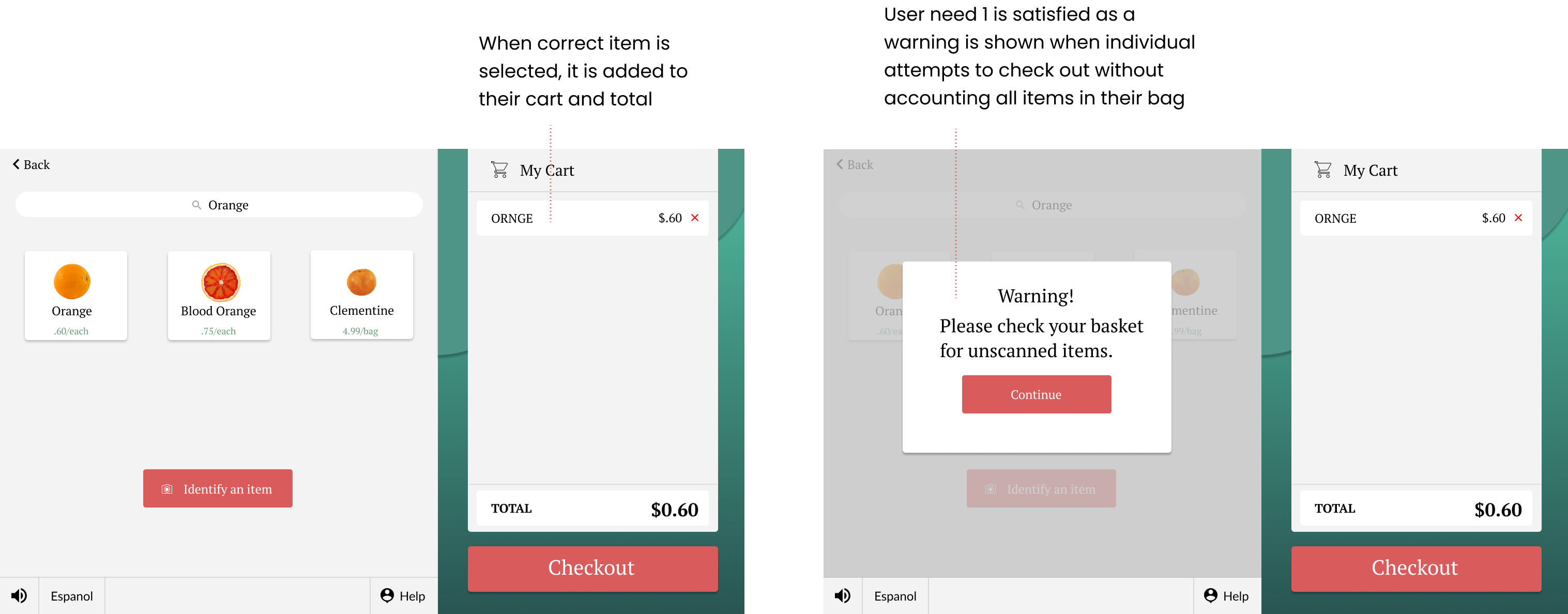
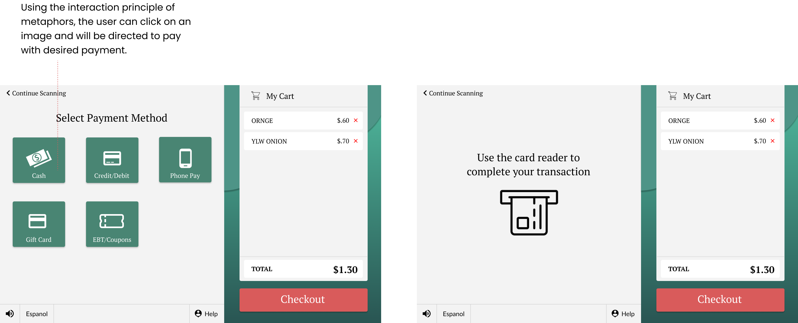
Navigation of the high-fidelity prototype
Most of the time spent on this project was doing research, instead of creating wireframes and
focusing on the visual designs of the system. I learned a lot about the process of user
research
and
really honed in on "why a user should use the system" and "how they should use it?".
If I were to do this project again, I think the approach to visual design would be
different.
Due to
time constraints, the visuals could be improved and I would focus more of how to personalize
the
system to cater to all genders and ages.
I, along with our clients, the Loss Prevention Research Center were quite satisfied with the
work my
team and I performed.
View next project →