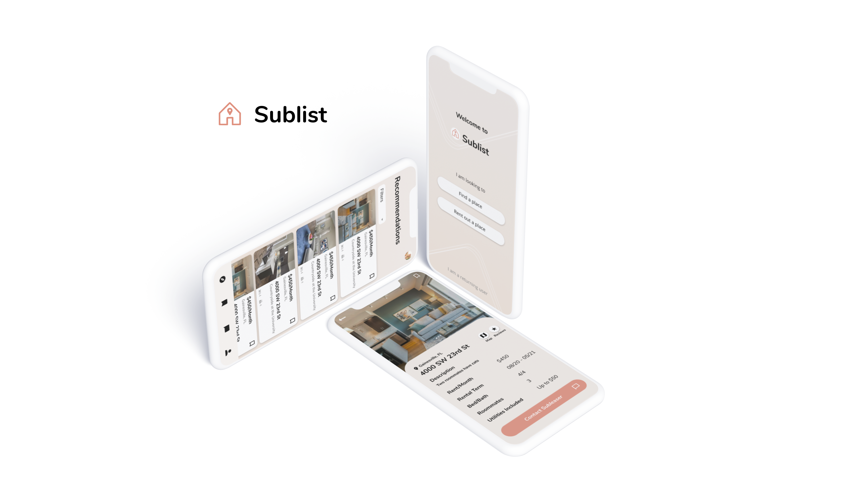

Currently the only way that someone can sublease their apartment is through services such as Facebook or going directly to a private company that owns the apartment complex. The system we are creating is to streamline an outdated form of subleasing, improving interactions between the user and forms. Our system is a dedicated place where subleases can be posted and organized much more cleanly to help make subleasing much more efficient and hassle-free.
R E S P O N S I B I L I T I E S
UX &
HCI
Research,
UX Design,
Testing,
Visual Design
T I M E L I N E
February 2020 - May 2020
Team of 4 Researchers
There is not a dedicated place where subleases can be posted and organized cleanly to help make subleasing much more efficient and hassle-free. Our research and design is intended to streamline an outdated form of subleasing.
We are proposing a new application intended to connect subletters with those searching for temporary living arrangements.
These interview sessions were conducted in-person and a
structured interview protocol was used. The protocol
consisted of three parts:
1) Experience searching for a place to
sublease
2) experience searching for a subtenant
3) the participant’s ideal sublease search experience
• Each part of this interview was open-ended and the protocol included
follow-up questions to prompt the participant to include
more details in their responses.
• Most students interviewed who
have tried subleasing their apartments have used tools such
as Facebook Marketplace, asking leasing offices, or by
simply asking around.
• The interviewees all seemed to
express discontent in the organization and effectiveness of
these tools. Platforms like Facebook Marketplace contain a
lot more content than people looking for subleases. This
means that it is very easy for postings to get lost, so it
is
much harder for subtenants to find.
• Another issue people
have with subleasing is the process of posting. Many found
it time-consuming to write up the whole description of their
apartment. Because these descriptions are only in paragraph
form, it is difficult to quickly rule out unwanted listings.

We performed competitive analysis on a few companies, such as Facebook Marketplace and
Craigslist, to
better identify how they approached their solution. We also evaluated which features
interviewees
expressed dissatisfaction with.
Pros
Categories to sort by
Page to view all subleases
Organized by features
Cons
Difficult to navigate
Not engaging for the user
Too much information within one page
Toolbar features too many categories
Pros
Categories to sort by
A view for items available
A map for location
Cons
Visually lacking
Too many links
No hierarchy or consistency
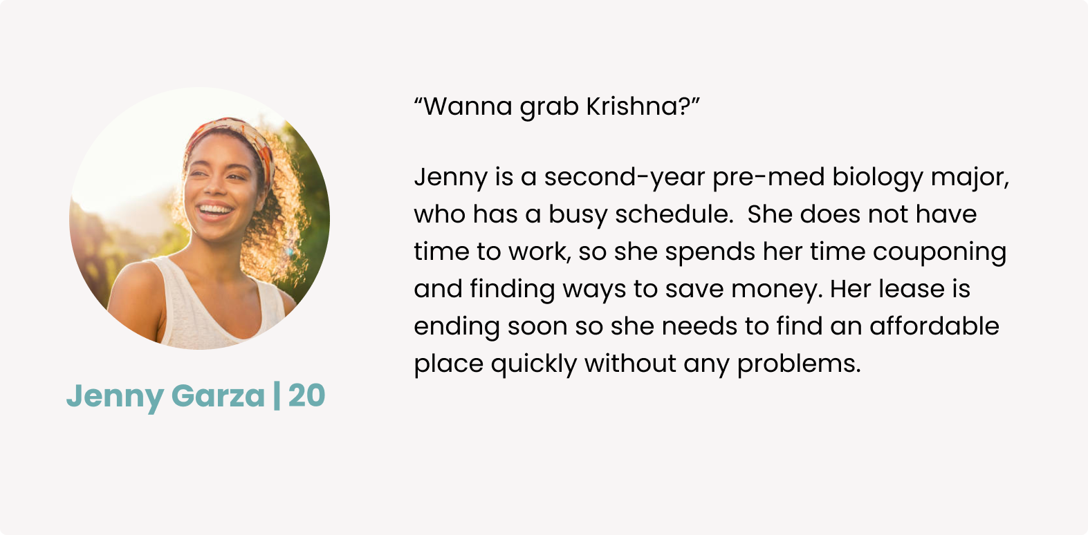
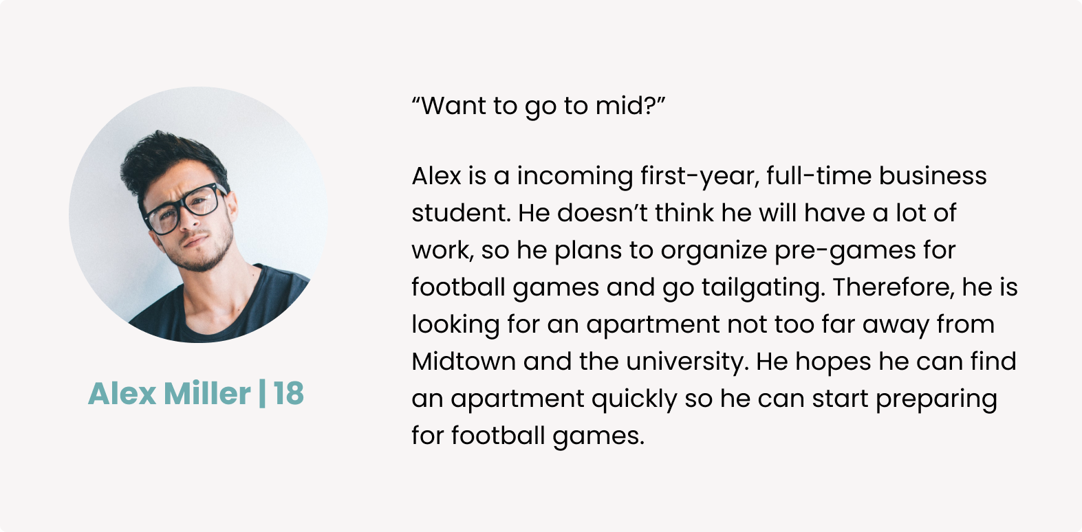
After reviewing all the collected data, the following user
needs should be addressed:
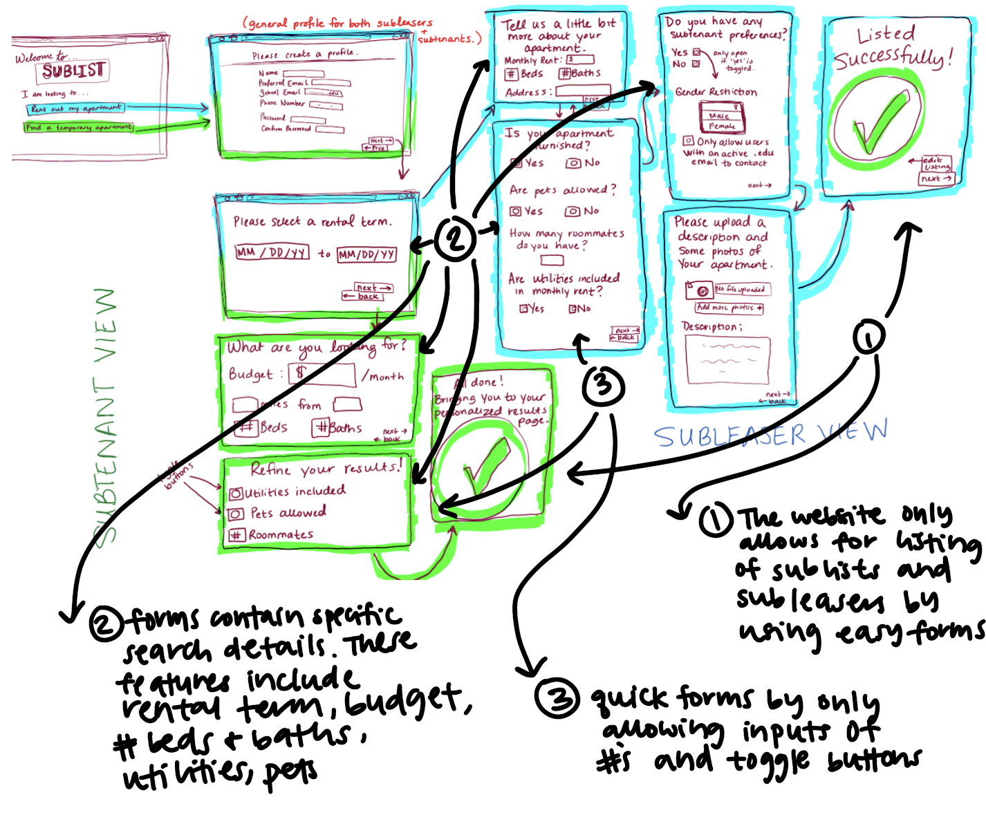
1. Designated interface specifically for subleasings
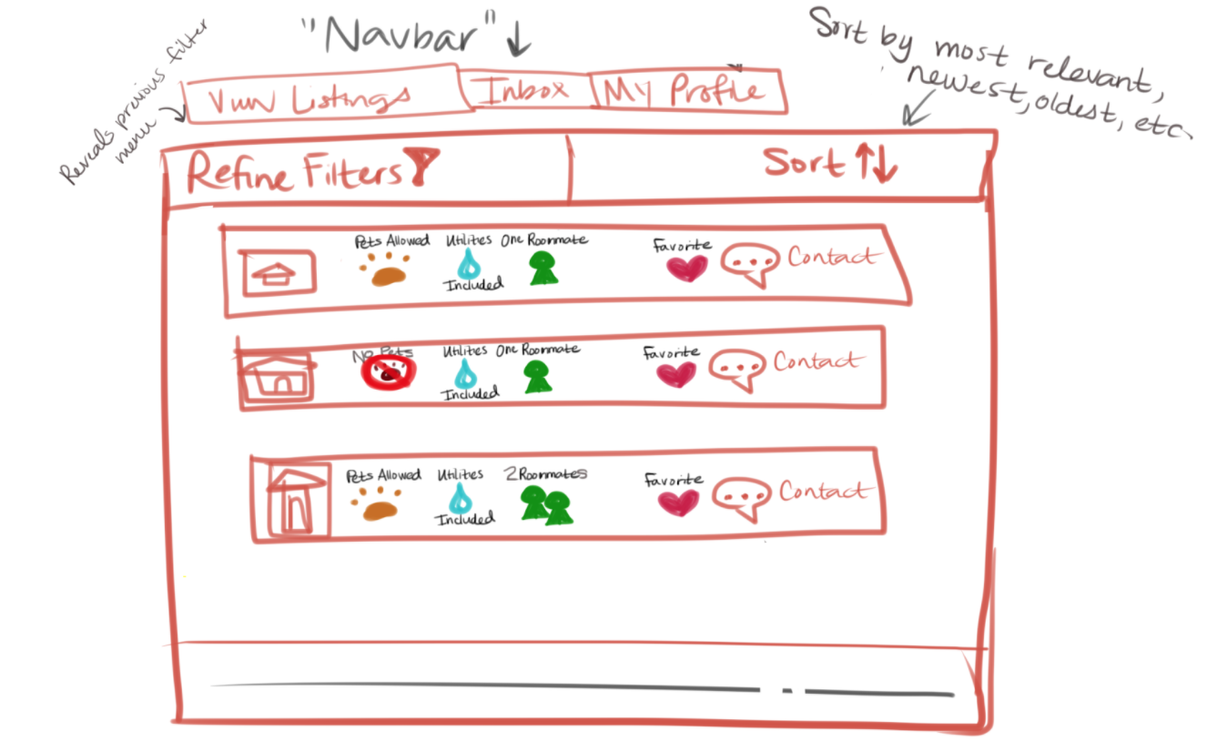
2. Sorting by specific details (location, price)
3. Quick general form (location, price point, etc.)
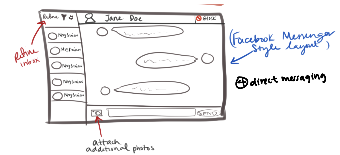
4. Direct messages organized by listings
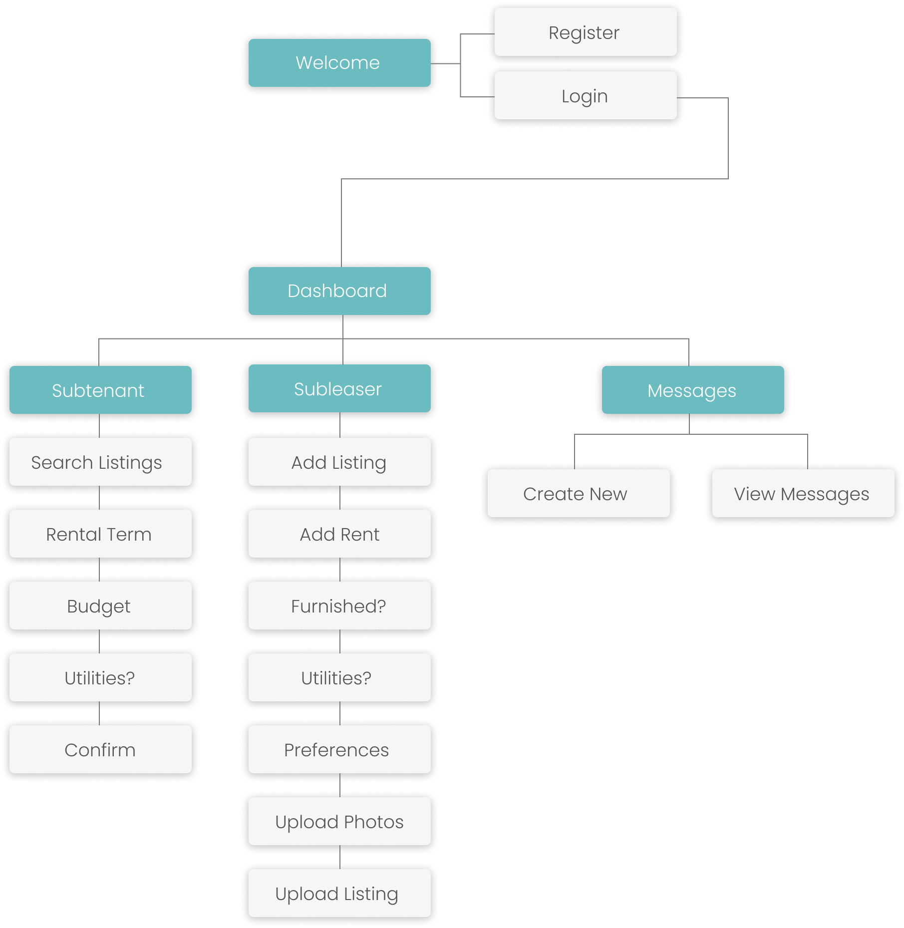
After pulling in all the team member's sketches together, we decided on features that are necessary for the design. The user needs are marked by numbers 1, 2, and 3.
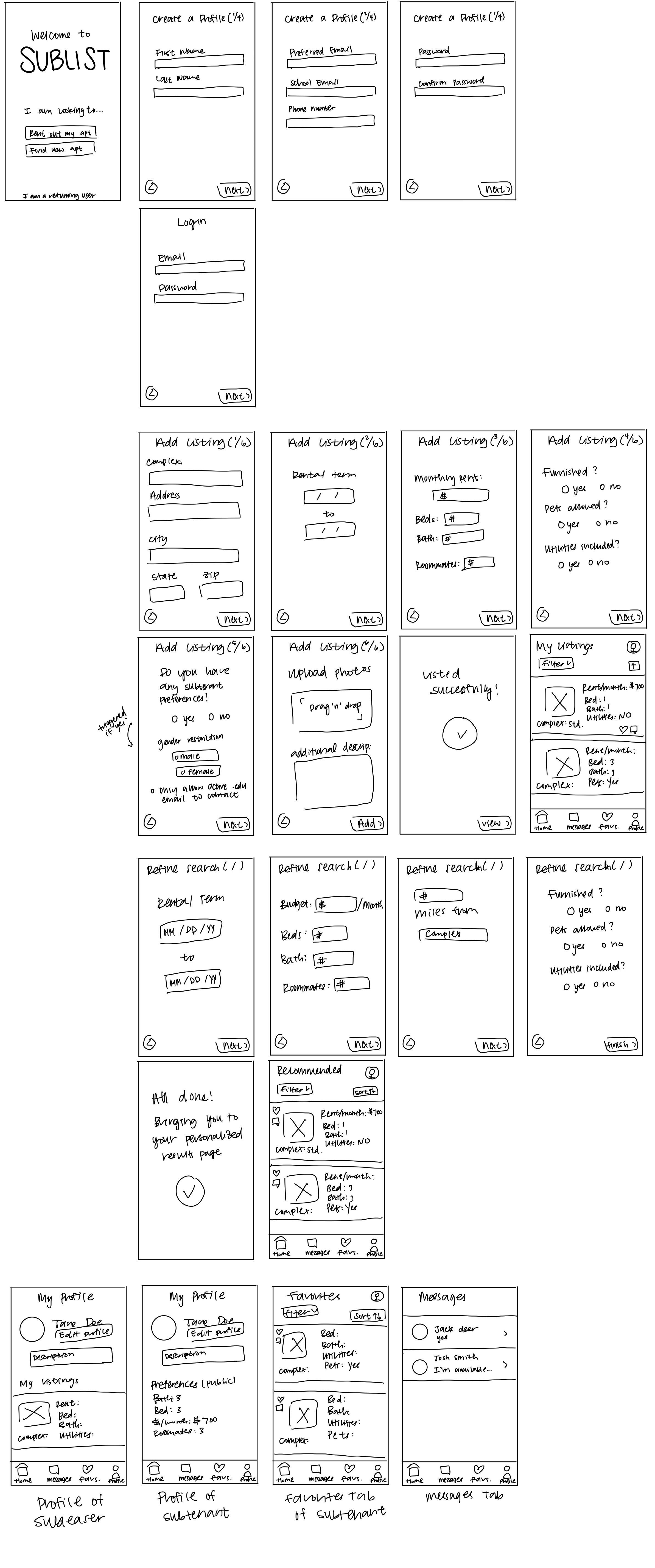
I created the low fidelity prototypes based on the sketches, just focusing on the features before looking at the UI. Due to time constraints, my team was only able create a web prototype. On my own, I decided to continue and be creative with the project and create an mobile application prototype.
We conducted think alouds with individuals to collect feedback on usability of our tool and
its
comparability to other existing tools.
Participants were asked to use the tool as if they
were posting a sublease or looking for a sublease
and to talk about any concerns they have with the
tool, as well as to compare the tool to any other
similar tools they were familiar with. With the think-aloud, we found that:
• Users want more descriptive forms.
• Users want clear navigation from the forms directly to listings.
• Users don't want inflexible forms.
For the final iteration, I searched for an asethically pleasing palette that would be easy on the eye.

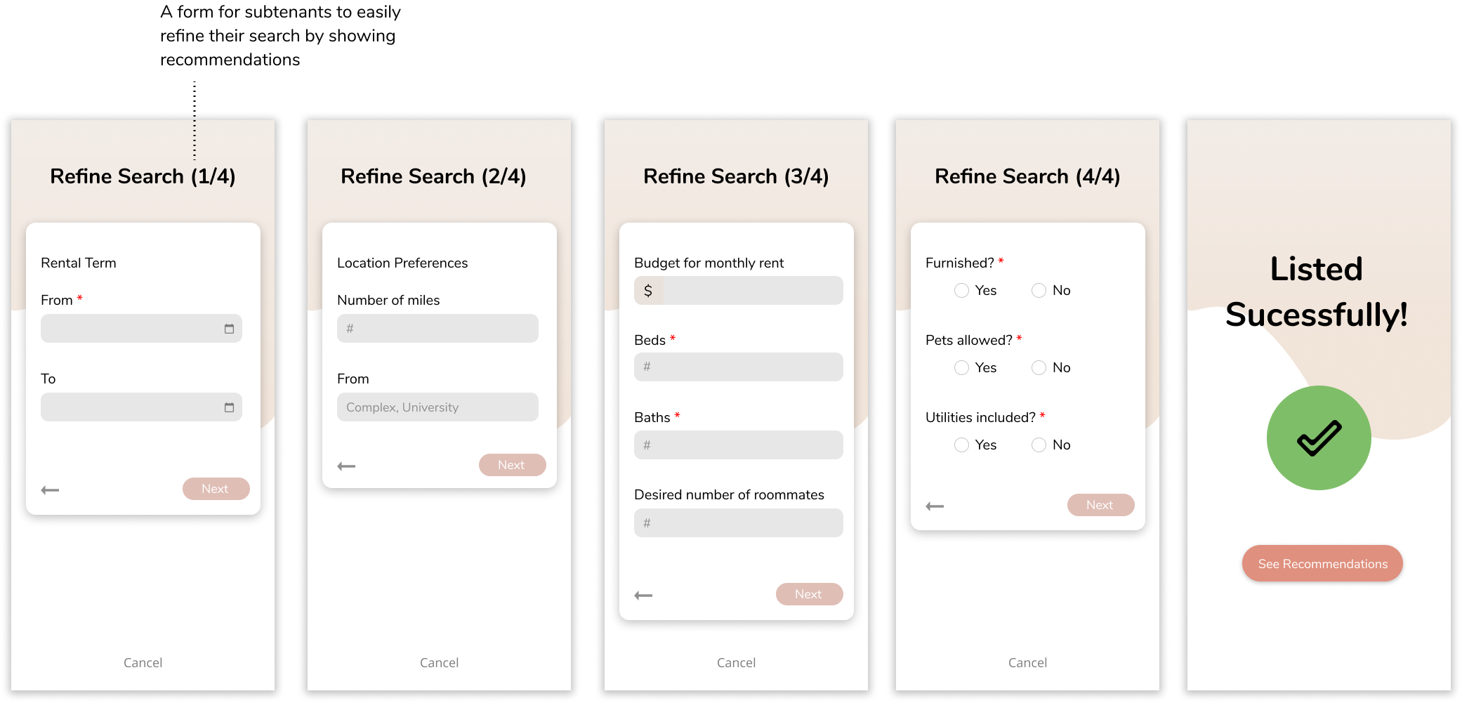
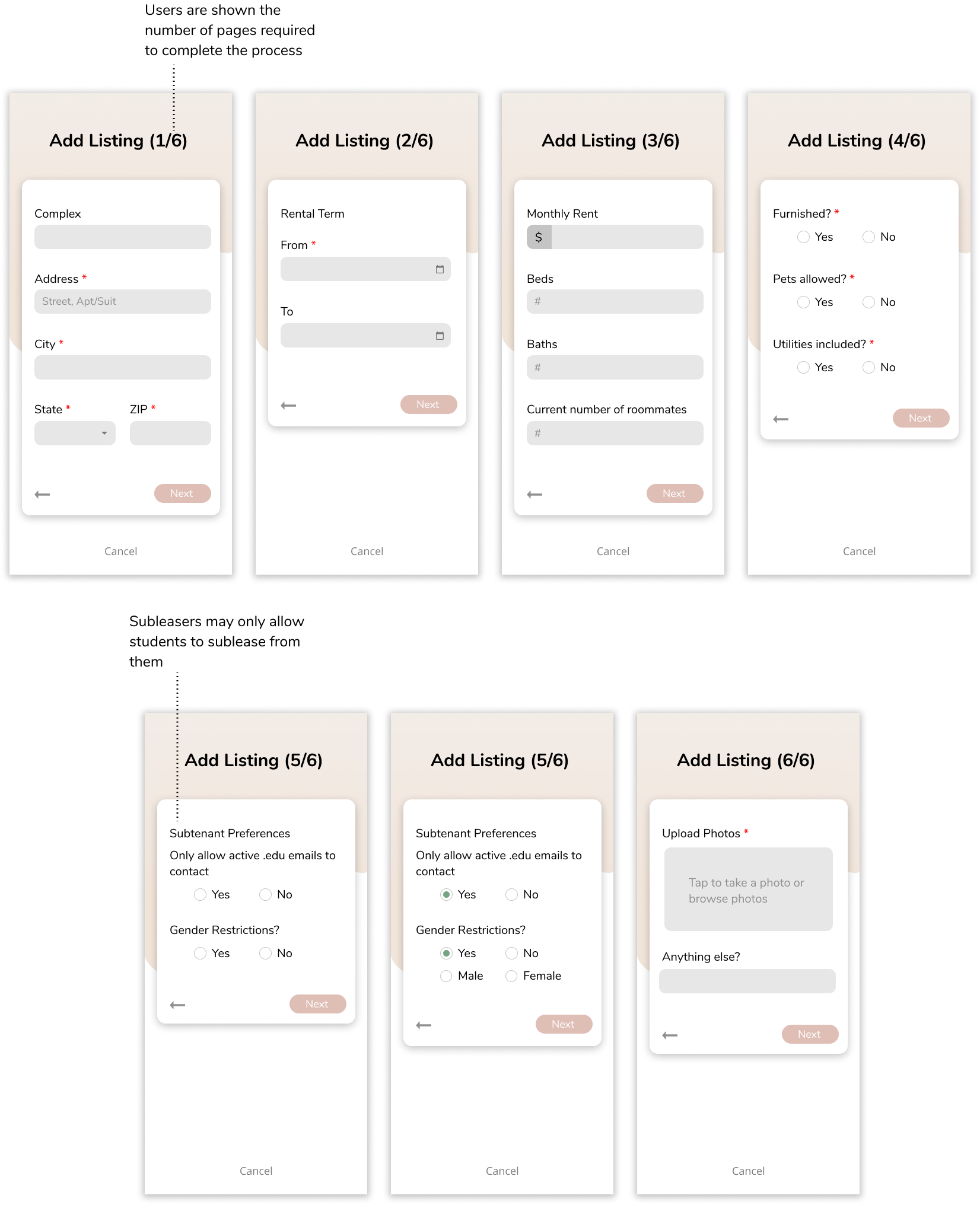
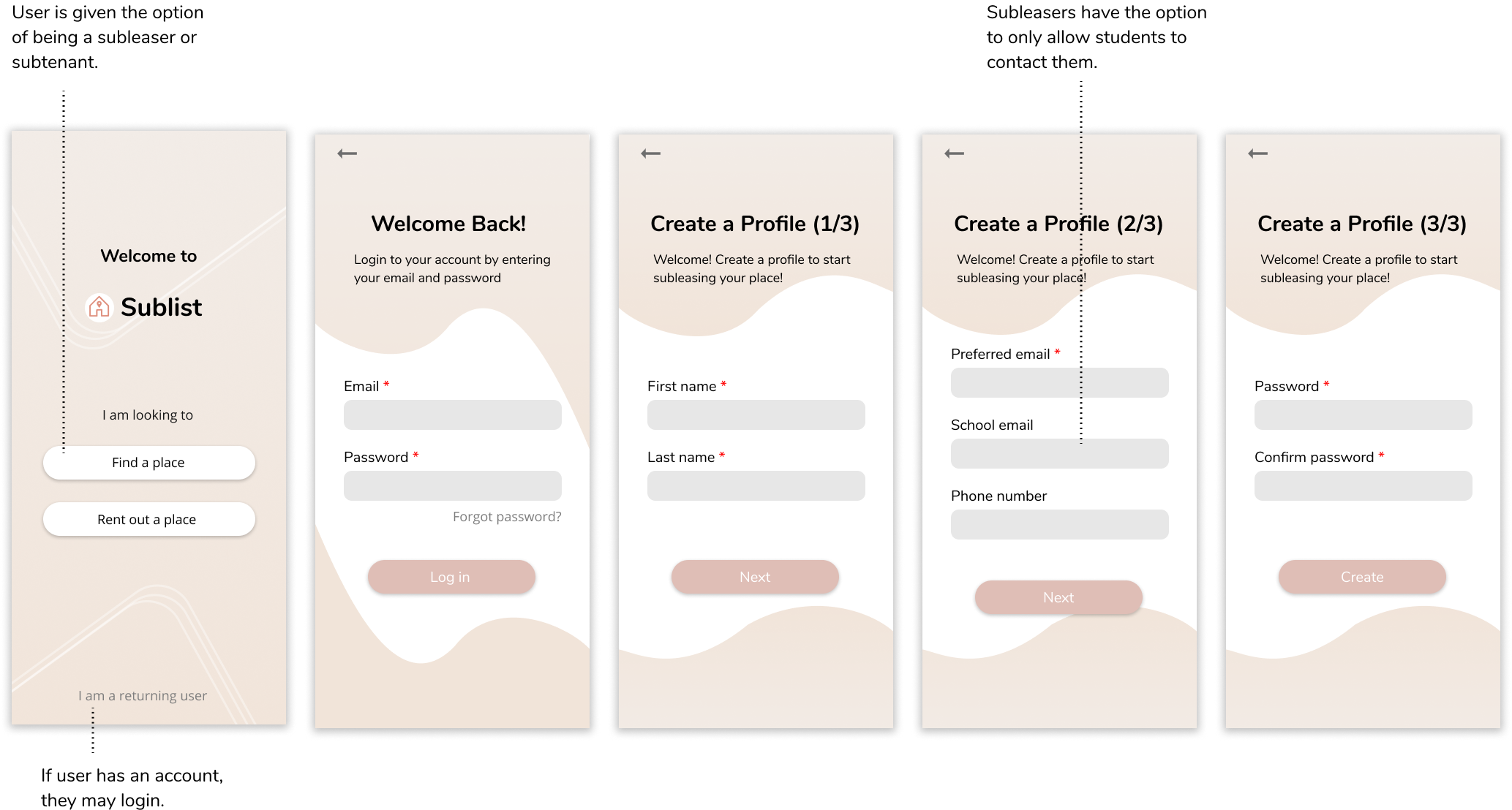
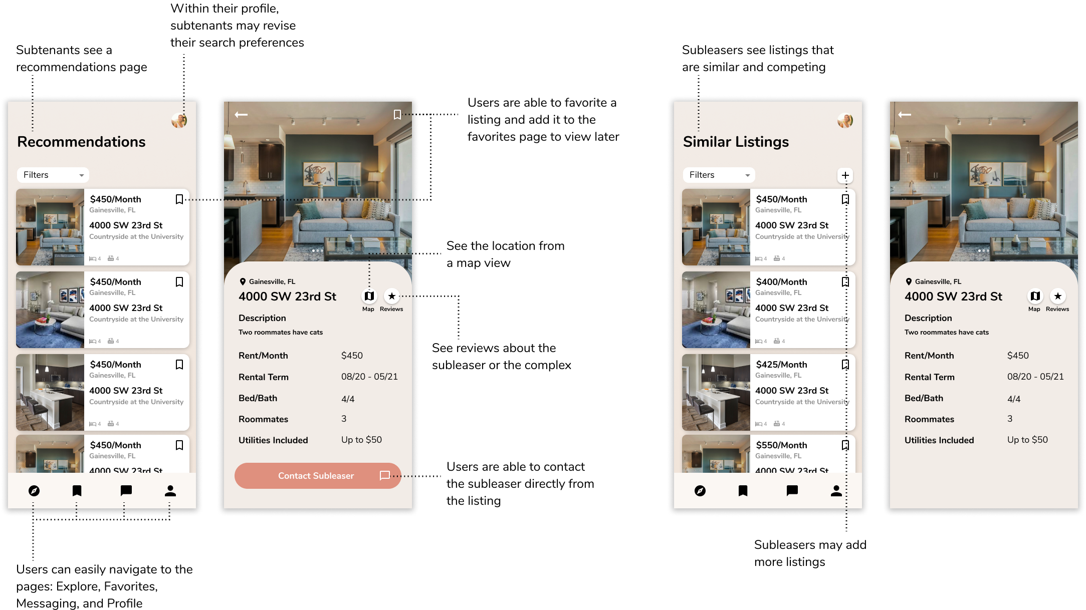
The high-fidelity mockups shown are the navigation for returning user, subleaser, and subtenants
respectively.
I learned that when creating a website, you must build trust with your users.
Because of time constraints, we were not able to implement adding accounts
from Google or Facebook. By adding other platform emails or log ins, this
would let users feel that the site is legitimate.
Before officially implementing this design, a few more interviews should be
conducted to make sure the previous points of concern are no long present.
Due to time constraints, we were not able to present the website to
potential users. Conducting interviews with the targeted audience would be
an essential next
step. Usability tests would also be very useful as it would show how easy or
difficult it would be to navigate through the interface.
View next project →